Brand Guidelines
This is bohly.
How we look, sound, and show up — the full corporate identity in one place. For partners, printers, designers, and anyone building with the brand.
01 — The Wordmark
Always lowercase. Always with the period.
The brand is written bohly. — lowercase, with the trailing period. Even at the start of a sentence. Never "Bohly", never "BOHLY".
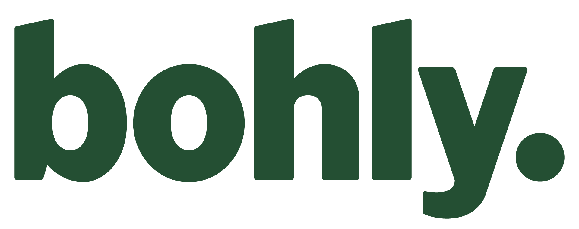
Primary wordmark — use on cream and light backgrounds.

White wordmark — use on green and dark backgrounds.
Do
- Write it lowercase with the period: bohly.
- Use the green wordmark on light backgrounds, the white one on green or dark.
- Give it room — keep clear space around the wordmark, nothing crowding it.
- Keep it legible: it runs 64px tall in the desktop nav, 44px on mobile. Don't go much smaller.
Don't
- Don't stretch, squash, rotate, or add shadows, outlines, or effects.
- Don't recolor it — green on light, white on dark, nothing else.
- Don't set the name in uppercase or title case in copy.
- Don't recreate the wordmark in type — always use the supplied files.
02 — Colour
Deep green. Warm cream. A pop of lime.
The palette in one line: deep green + warm cream + pale-lime accents, with near-black text. Click any swatch to copy its hex value.
03 — Typography
One typeface. Every weight.
Everything is set in Stack Sans Text — a variable font spanning weights 100–900. No secondary typeface, no exceptions.
Headings use sentence case. Display headings tighten to −0.03 / −0.04em; eyebrow labels spread to 0.2em uppercase; nav CTAs and tags sit at 0.1em uppercase. Avoid ALL CAPS in body copy.
04 — Voice
Direct. Warm. Never preachy.
The core idea behind every line we write:
Healthy eating that's fast, easy, and never boring — without sacrificing taste.
Headlines in use
- Healthy should never be boring.
- Know what's in your bowl.
- Fresh bowls built for you.
- Eating well is a form of self-respect.
Key messages
| Theme | Example line |
|---|---|
| Taste | "Bold flavours, zero compromise." |
| Variety | "Over 100+ bowl combinations — never the same twice." |
| Speed | "Ready in minutes, never rushed." |
| Health | "Real ingredients, chosen for flavour and function." |
| Accessibility | "Whether you're chasing a goal or just eating better." |
Words we avoid
- "Guilt-free" — overused, sounds defensive.
- "Clean eating" — sounds restrictive.
- "Diet food" — only to contrast against what bohly. is not.
- Emojis in headlines or formal copy.
- Exclamation marks — except in fun contexts like "Bim Bim BAM!"
05 — In Use
The system at a glance.
Core UI patterns, rendered live in the real styles — pill buttons, eyebrow labels, and tags on light, dark, and green grounds.
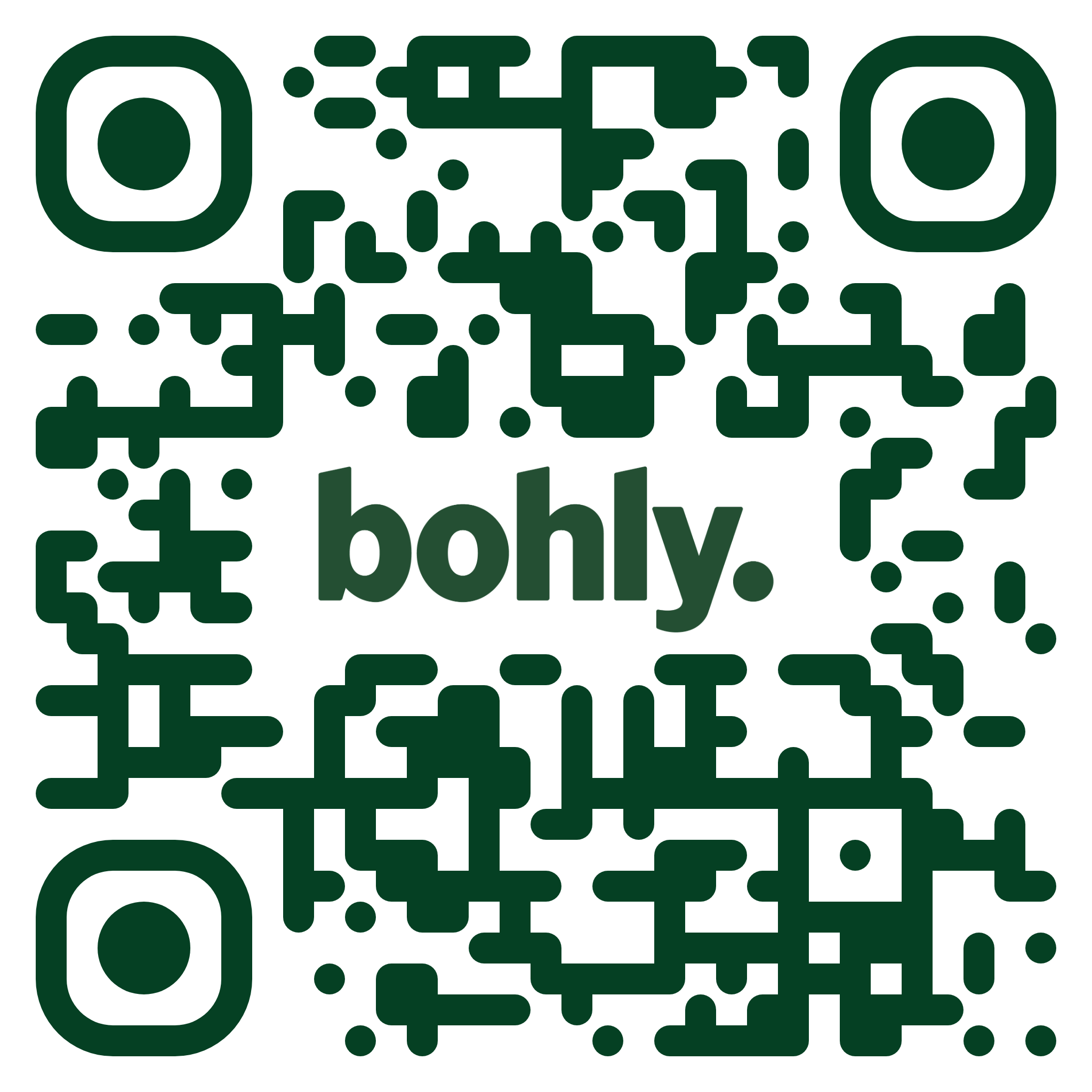
QR — green — for light surfaces: packaging, flyers, table cards.
QR — white — for green and dark surfaces.
Both codes use rounded modules to match the brand and point to bohlybowls.com/links — the hub for ordering and socials. Use the supplied files only; regenerated codes lose the rounded style.
06 — Assets
Download the originals.
Always work from these files — don't recreate, retrace, or re-export from screenshots.
-
Master logo — vectorAI (Adobe Illustrator) · green + white wordmarks · for printers and designers
-
Primary wordmark (green)PNG · transparent · for light backgrounds
-
White wordmarkPNG · transparent · for green and dark backgrounds
-
FaviconPNG · browser tabs and app icons
-
QR code — greenSVG (print-ready) · PNG also in brand assets/qr/
-
QR code — whiteSVG (print-ready) · PNG also in brand assets/qr/
-
Stack Sans TextVariable TTF · weights 100–900 · the only typeface